 Home
Home About us
 Offers
 90 days MVP
 AI automation
 Staff Augmentation
 Portfolio
 Blogs
Blogs Contact Us
Tenant Data Isolation: Patterns and Anti-Patterns
Explore effective patterns and pitfalls of tenant data isolation in multi-tenant systems to enhance security and compliance.
Jul 30, 2025
Read More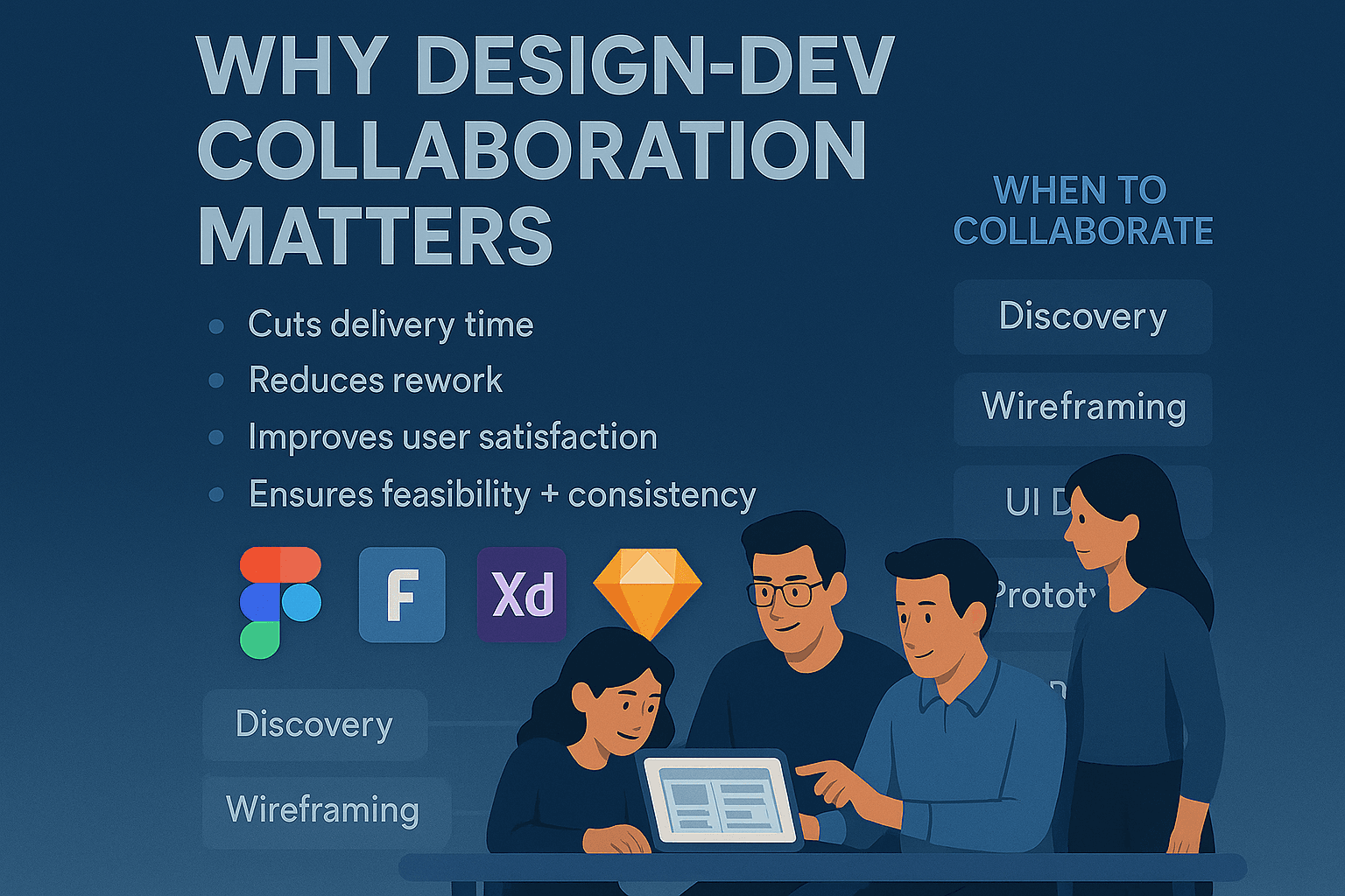
Want to streamline your design process and improve team collaboration? Figma is the tool you need. Here's how Figma helps teams create, manage, and scale design systems effectively:
Figma simplifies design workflows, bridges gaps between teams, and ensures consistency in your projects. Whether you're a startup or a growing team, Figma is your all-in-one solution for design system collaboration.
A well-structured design system can make teamwork smoother and help designs scale effectively. To get started, it’s essential to understand Figma’s hierarchy: file > page > frame. This structure directly influences how components appear in the assets panel and how your team navigates through them. Organizing your workspace, team, projects, and files in a logical manner ensures everyone stays on the same page.
In Figma, pages function as categories within your files. Use them to separate and organize different types of components. For example, dedicate specific pages for "Buttons", "Forms", "Navigation", and "Typography."
Start with basic, atomic components like buttons and icons, then build them into more complex elements. Here’s a practical way to structure your files:
Consistent organization helps Figma’s real-time collaboration shine by ensuring the team can quickly access updated components. One redesign effort even reduced file memory usage by 70%, showing how impactful a clean structure can be.
A clear naming system is key to managing components effectively. Figma recommends using a slash-separated naming convention, such as Button/Primary, Button/Secondary, or Button/Disabled.
"We recommend you use the slash-separated convention, such as
Component/StateorIcon/Name."
Here are some helpful naming tips:
__)./) and add spaces between names if needed..) or underscore (_) to keep them hidden.Adding descriptions to components is equally important. Include details about their purpose, usage, and accessibility considerations. Use documentation containers to attach examples and technical requirements.
"Naming plays a crucial role in creating and sharing things. Why? Because eventually, we will share them with others, and ideally, others will use the things we name."
Make sure your team agrees on a standardized naming structure and sticks to it.
Shared libraries are the backbone of a design system. They allow you to reuse components, styles, and variables, ensuring consistency across projects.
To manage libraries effectively:
Enable shared libraries in other files so the entire team can access them. Announce new libraries and provide easy-to-follow instructions for enabling them.
Keep libraries up to date with version control, and communicate changes clearly. Permissions are also important - grant editing rights only to design system maintainers, while others should have view-only access.
"A shared library in Figma allows designers to create reusable components, styles, and assets... This promotes uniformity and accelerates the design process by eliminating the need to create components from scratch every time."
"Keep it simple and do not make things too complicated in terms of naming, plugins, or readability. It has to be both easy to maintain and easy to use."
Figma's real-time collaboration tools have redefined how teams work on design systems. Unlike older design tools that rely on constant file sharing and version tracking, Figma allows multiple team members to collaborate on the same file in real time, eliminating version conflicts and keeping everyone on the same page.
Figma's multiplayer editing enables multiple users to work on a single design file at the same time, with each person's cursor uniquely colored and labeled for easy identification. Since it's a cloud-based platform, updates happen instantly, no matter where team members are located.
This feature is particularly useful for building design systems. For instance, one designer can focus on refining button styles, another can develop form elements, and a third can document usage guidelines - all without stepping on each other's toes.
"Figma really brings together different parts of the team - designers, project managers, product managers, engineers, and others. The amount and quality of feedback is 10X better than before." - Shawn Lan, Head of Design at Zoom
To make the most of multiplayer editing, it's smart to plan ahead. Assign clear roles and responsibilities before diving into a collaborative session. This ensures everyone knows their focus area, reducing confusion. Organizing files with separate pages for different components can also help avoid overlapping work.
Once collaborative editing is running smoothly, managing access and permissions becomes a key part of maintaining an efficient workflow.
Efficient collaboration relies on effective permission management. Figma provides four main permission levels - Can view, Can edit, Admin, and Owner - to ensure every team member has the right level of access.
Figma's permission system operates across three levels - team, project, and file. File permissions take priority over project settings, which in turn override team permissions.
Here are some tips for managing permissions effectively:
For projects requiring extra confidentiality, Figma’s paid plans let you restrict viewers from copying, sharing, or exporting files. Fine-tuning link-sharing settings can further limit access.
Figma's comment and version history features complement real-time editing, creating a transparent and organized workflow. Comments can be attached directly to specific design elements, ensuring feedback is clear and actionable. Using @ mentions, team members can tag colleagues, start threaded discussions, and resolve comments once issues are addressed.
The version history feature logs every change, showing who made edits and when. Combined with the comment system, this provides a clear record of decisions and feedback, keeping the design process transparent.
For maintaining design systems, comments are invaluable for documenting decisions about component updates. For example, if a button style is modified or a new variant is introduced, the comment history can explain the reasoning behind the changes. This context is especially helpful when questions arise later.
Additionally, Figma's real-time features make design critiques more interactive. During video calls, you can share your screen while team members leave comments and suggestions directly in the design. This approach not only streamlines feedback but also fosters a more collaborative and engaging review process.
As your team collaborates effectively in Figma, the next hurdle is maintaining consistency and quality as your design system evolves. Without clear rules, contributions can lead to inconsistencies. A structured approach ensures your design system stays cohesive while giving teams the flexibility to adapt and innovate. These strategies create a foundation for systematic reviews and balanced contributions.
Contribution guidelines act as a filter, ensuring that new additions align with your system’s goals and standards. They should address three key questions: Who can contribute? What qualifies as a contribution? How do proposals move from concept to implementation?
Nathan Curtis, a recognized design systems expert, puts it this way:
"A design system contribution is any proposal - design, code, documentation, or asset - that adds a new feature or fix, contributed by team members beyond the core group".
To manage contributions effectively, classify them by their scope and impact. Many organizations use a three-tier system:
These tiers make it easier to evaluate contributions and prioritize work.
Your guidelines should also outline core principles, such as accessibility standards, consistent naming conventions for components and variables, and alignment with company objectives. Accessibility is especially important - it ensures every contribution meets essential usability standards.
To streamline the process, create templates for proposals. These templates should capture critical details like the problem being addressed, the proposed solution, affected components, and the anticipated impact. Standardizing this information helps the core team review submissions more efficiently.
An effective approval process balances thorough reviews with timely progress. For example, Pluralsight reviews submitted pull requests within seven days. Contributors must follow coding conventions, complete testing, and often go through multiple feedback rounds before approval.
Using branching is another smart move. It lets contributors experiment on separate branches or files without affecting the main design system until their work is approved.
Figma’s approach to reviews, as explained by Kris Rasmussen, its Chief Technology Officer, emphasizes early and frequent feedback:
"The engineering crit plays a very specific role. It's a place to solicit feedback early and often. It is a forum to get expert support on technical designs. It is not an approval process".
Automated tools like design linters can also audit designs for compliance with system requirements. Establishing clear acceptance criteria and documenting timelines, such as weekly review meetings, ensures teams can plan their work effectively.
Once guidelines and review processes are in place, the next challenge is balancing centralized control with team autonomy. A well-maintained design system requires a hybrid approach: a central team provides overall direction, while product teams are empowered to propose new features and updates.
The central team should accept contributions that align with core standards while filtering out changes that could disrupt consistency. At the same time, offering base components that teams can extend allows flexibility without losing sight of core design principles.
Breaking a large design system into smaller subsystems is another effective strategy. This "system of systems" approach lets different product areas operate independently while staying aligned with the overall system.
As Ryan Tinsley, Staff Product Designer at eBay, notes:
"We've seen teams level up their work dramatically by referencing our documentation".
To further support teams, consider regular office hours and one-on-one sessions. These provide early guidance, reducing the risk of misaligned proposals. Tools like semantic versioning and detailed changelogs also help by clearly communicating updates and their potential impact.
Creating a design system is just the first step. The real challenge? Keeping it relevant and effective as your organization evolves. A design system that adapts and grows with your team becomes an invaluable tool, while a stagnant one quickly loses its usefulness. The secret lies in setting up processes that balance consistency with opportunities for improvement.
To keep your design system running smoothly, regular audits are a must. These reviews help uncover outdated elements, inconsistencies, or gaps before they turn into larger issues.
Start by scheduling quarterly audits. Check for components that haven’t been updated in a while, redundant variations that could be consolidated, and styles that no longer align with your brand’s direction. This proactive approach keeps your system lean and easy for your team to navigate.
Instead of overhauling everything at once, make incremental updates. Large-scale changes can disrupt workflows and overwhelm your team. A better approach? Focus on small, manageable updates - like refining one component family per sprint - so improvements happen steadily over time.
As design systems expert Louis Massuel puts it:
"Design systems rely on user feedback and iterative improvement. Start small, test, simplify, and iterate".
To decide where to start, use a prioritization matrix. Evaluate components based on how often they’re used, the effort needed for updates, and how well they align with current goals. This helps you focus on updates that will have the most impact.
Before rolling out changes, validate them with your team. This step reduces the risk of unintended issues and ensures the updates address actual needs. For deprecated components, clearly label them with suffixes like "DEPRECATED." You can also flag them with warning icons or notes in the component descriptions. This gives your team time to transition to updated elements without causing confusion.
Finally, share updates with your team as soon as they’re ready. Keeping everyone informed ensures smooth adoption and avoids unnecessary missteps.
Consistent communication is key to successfully implementing a design system. Figma’s built-in documentation tools can help keep everyone on the same page.
Use the properties sidebar in Figma to add concise descriptions for components. Include usage guidelines, accessibility notes, and details about recent updates. Similarly, provide descriptions for styles to clarify their purpose and application.
Organize your libraries in a way that makes sense to your team. Use Figma’s hierarchical naming structure, like "Buttons/Primary/Large", to create clear groupings. This structure helps designers find what they need quickly. Reinforce this organization by using pages and frames within your library.
Team libraries in Figma make it easy to share components and styles across projects. However, since Figma’s versioning tools are limited, be extra cautious with updates that could disrupt existing designs. Test changes in isolated files or a staging library before publishing them to your main library.
When announcing updates, provide direct links to the updated components or documentation. This saves your team from having to search through the system to find what’s new.
Once updates are shared, gathering feedback is essential for ongoing improvement. Your team’s input is the best way to identify what works, what doesn’t, and where there’s room for growth. The challenge is collecting this feedback without overwhelming your team.
Build feedback checkpoints into your workflow - during ideation, design reviews, handoffs, and QA. Catching issues early saves time and effort down the line.
Weekly sync meetings between UX and development teams can help address misalignments before they escalate. Use these sessions to discuss component performance, identify pain points, and plan future updates. Keep the meetings focused on actionable outcomes.
Figma’s collaboration features also make feedback collection easier. Use comments to direct attention to specific areas, or leverage FigJam for brainstorming and retrospectives. These tools keep feedback organized and actionable.
Pay attention to how each team interacts with the design system. Developers might need technical details, while product managers may require broader context. Tailoring your communication to these needs ensures everyone gets the information they need.
For example, a recent collaboration between a UX team and a front-end component team highlighted the value of cross-functional feedback. When developing a combined search and toolbar component, the teams worked together to refine both functionality and user experience, resulting in a stronger final product.
To accommodate different working styles, offer multiple feedback channels. Some team members may prefer leaving asynchronous comments, while others thrive in real-time discussions. Providing both options increases participation and ensures you gather diverse insights.
Finally, document recurring feedback trends and share them with your team. If multiple people flag the same issue or request similar features, make these patterns visible. This transparency builds trust and helps everyone understand the system’s priorities.
Figma isn’t just a design tool - it’s a bridge that connects design, development, and marketing teams. By acting as a central hub, Figma ensures everyone operates from the same source of truth while maintaining their unique workflows. This alignment helps organizations maximize the potential of their design systems.
The handoff between design and development is a critical step in any project. Figma’s Dev Mode streamlines this process by translating design elements into code specifications developers can easily use.
To make this process seamless, stick to consistent naming conventions that align with your design system. This helps developers quickly understand the component hierarchy and reduces unnecessary back-and-forth. Figma’s inspect panel is another key feature, offering developers precise details about measurements, colors, and typography. Adding contextual comments is also essential - clarify interaction states and accessibility requirements that aren’t immediately obvious from the visuals.
For more complex interactions, create detailed prototypes to demonstrate expected behaviors. Link these prototypes to your main design files so developers can reference both the static designs and interactive flows. This approach minimizes misunderstandings and ensures components behave as intended.
Integrating Figma with tools like Visual Studio Code and Storybook can further enhance efficiency. These integrations allow developers to access design specifications directly within their coding environments, speeding up implementation and reducing friction.
Marketing and sales teams often need quick access to assets without waiting on designers for every request. Figma’s shared libraries make this possible while maintaining brand consistency.
One standout tool is Figma Buzz, which enables marketers to create on-brand assets at scale using pre-built templates. Simone Dehel, Senior UX Designer at O3, shared her experience with Figma Buzz:
"Figma Buzz has already proven to be a game-changer for asset generation. Using Figma Buzz has improved collaboration with our marketing team, reduced unnecessary stress, and overall streamlined our process. I'm excited to grow our library of templates."
When designing templates for marketing teams, lock in critical brand elements like logos, color schemes, and typography, but allow flexibility in content areas. This ensures creative freedom without compromising brand integrity.
For campaigns requiring high-volume asset creation, Figma Buzz offers a powerful feature: linking text and image fields to spreadsheet columns. This allows marketing teams to quickly generate multiple variations for different audiences, campaigns, or channels without manually recreating each asset. Bethany Valoe, Associate Creative Director at Affirm, highlighted the impact of this approach:
"Figma Buzz takes a lot of the executional work off our plate, so the team can focus on what they do best - thinking big and pushing the brand forward."
To support marketing efforts further, build a visual identity system in Figma. Include not just logos and colors, but also photography styles, iconography, and layout principles. Keep this system updated so it evolves with your brand.
Once processes are established for developers and marketing teams, the next step is ensuring smooth template and library management across all teams. Start by organizing your Figma teams to reflect your product structure - such as separate spaces for web, iOS, and Android teams. This setup allows different groups to work independently while staying connected to the overarching design system.
Use Project Pages as central hubs for cross-functional projects. Pin key files, add notes for context, and create clear navigation paths for team members less familiar with design tools. These hubs are especially useful during product launches or major feature rollouts when multiple teams need coordinated access to design assets.
Leverage Figma’s built-in collaboration features to establish clear communication protocols. Integrating Figma with tools like Slack, Microsoft Teams, or Jira ensures that feedback and decisions flow seamlessly across teams. This improves feedback quality and keeps everyone aligned.
For marketing-specific workflows, use FigJam for brainstorming, customer journey mapping, and campaign planning. These collaborative spaces help marketing and design teams align on concepts before diving into detailed asset creation. Additionally, create multiple variants of marketing templates to support personalization across campaigns and channels. This approach reduces repetitive design work while ensuring consistent branding.
Regular sync meetings between design, development, and marketing teams are crucial for addressing evolving needs and sharing updates about system changes. These check-ins don’t need to be lengthy - 15-minute weekly meetings are often more effective than longer, less frequent sessions.
Finally, remember that not everyone is equally comfortable with design tools. Offer role-specific training tailored to each team’s needs. Developers may benefit from deep dives into Dev Mode, while marketing teams might focus on template customization and asset export features. By providing targeted training, you’ll ensure every team gets the most out of Figma.
Collaborating effectively in Figma requires finding the right balance between structure and adaptability. Design systems play a crucial role in aligning teams by providing a shared visual and functional language.
Here’s a recap of the key steps to make the most of Figma’s collaborative potential.
The groundwork for successful collaboration in Figma begins with thoughtful setup and organization. This includes creating shared libraries that act as a single source of truth and establishing a clear, organized framework for everyone involved.
Figma’s real-time collaboration tools are essential for team productivity. Features like live cursors, embedded chat, and multiplayer editing allow team members to work together seamlessly while staying in sync. Additionally, the comment system ensures feedback is structured and actionable, keeping projects on track.
To maintain order in design systems, governance and contribution management are key. By implementing approval workflows and clear contribution guidelines, teams can maintain consistency without stifling creativity.
Lastly, cross-team integration is vital. Connecting Figma with development workflows, offering template libraries for marketing teams, and ensuring smooth handoffs between departments elevate Figma from a design tool to a central hub for collaboration across the organization.
For startups and small businesses, Figma offers tangible benefits. Take Airfocus, a project management startup, as an example. After adopting Figma’s collaborative tools, they achieved a 40% reduction in their design cycle, enabling them to launch products faster. As Vitaliy Isakov, Co-founder and CEO of Airfocus, shared:
"Figma has been a game-changer for us. We cut our design cycle by 40%, allowing us to launch our product faster and stay ahead of competitors."
Figma’s pricing model, which includes a robust free tier and scalable subscription options, ensures predictable costs as teams grow.
Additionally, Figma’s component-based approach helps startups establish a consistent brand identity early on. Reusable design elements and well-maintained style libraries enable even small teams to achieve efficiency and consistency that rival larger organizations.
With these advantages in mind, taking the first steps to build your design system is critical.
Start by conducting an audit of your current UI elements to identify patterns and eliminate redundancies. Focus on foundational components that can scale as your needs evolve.
Adopt clear and functional naming conventions from the beginning. Names should reflect purpose rather than appearance and align with your development team’s coding practices. This approach reduces confusion during handoffs and ensures the system remains manageable.
Equally important is creating thorough documentation and sharing it across your organization. Clear guidelines help ensure everyone uses the design system effectively.
Finally, keep in mind that design systems are dynamic and require regular updates. Plan for periodic reviews and expansions to keep pace with your product’s growth and evolving needs. By starting with essential components and well-defined processes, you’ll set the stage for continuous improvement as your team and projects grow in complexity.
Figma's real-time collaboration tools transform teamwork by letting multiple team members work on the same design at the same time. No more endless file exchanges or worrying about outdated versions - everyone stays on the same page, literally.
Features like live commenting, integrated chat, and instant feedback make communication straightforward and decisions faster. This is a game-changer for remote teams, helping them coordinate effortlessly, refine designs quicker, and maintain a cohesive workflow.
To make your design system in Figma efficient and user-friendly, begin by setting up a well-organized file structure. Create separate files for essential elements like UI kits, design foundations, and reusable components. Inside these files, group related designs in a logical way to make navigation straightforward.
Stick to a clear and consistent naming system for your components and layers. This makes it easier for team members to locate and understand elements. Use pages and frames to divide different sections or features, keeping the layout tidy and easy to scale. A structured approach like this not only streamlines collaboration but also minimizes confusion across teams working within the system.
Startups can tap into Figma's real-time collaboration tools and shared design libraries to create and maintain a unified brand identity across their teams. These features simplify the process of standardizing design elements, ensuring consistency, and keeping workflows smooth and efficient.
For small teams, Figma's free plan is a great starting point. As your startup grows, you can explore scalable paid options that align with your expanding needs. This approach allows startups to produce high-quality, professional designs without breaking the bank, helping them maintain a strong brand presence while staying within budget.
Need an expert team to provide digital solutions for your business?
Book A Free CallDive into a wealth of knowledge with our unique articles and resources. Stay informed about the latest trends and best practices in the tech industry.
View All articlesExplore effective patterns and pitfalls of tenant data isolation in multi-tenant systems to enhance security and compliance.
Jul 30, 2025
Read More
Implement these 10 Quality Assurance steps to enhance the reliability and performance of your SaaS application while minimizing bugs and user abandonment.
May 21, 2025
Read More
AI automation is revolutionizing SaaS performance by optimizing costs, enhancing user experiences, and streamlining operations.
May 15, 2025
Read More
Learn effective strategies to debug third-party API errors and maintain application stability while enhancing user experience.
Jul 30, 2025
Read More
Learn how to successfully launch your SaaS MVP in just 90 days by following these critical steps for validation, development, and iteration.
May 16, 2025
Read More
Learn how to safeguard your API backends against rising Man-in-the-Middle attacks through encryption, authentication, and secure network practices.
Jul 30, 2025
Read More
Choosing between a mobile app and a web app for your SaaS product? Explore key factors like cost, user engagement, and development speed.
May 21, 2025
Read More
Learn best practices for linting React code to improve quality, consistency, and collaboration in your development projects.
Jul 30, 2025
Read More
The IT industry continues to drive innovation and redefine the way businesses operate. In this blog, we explore how IT solutions are transforming industries, enhancing...
May 8, 2025
Read More
When it comes to SaaS (Software as a Service) platforms, one thing is clear: user experience (UX) is everything. At Propellius Technologies, we know that...
May 8, 2025
Read More
Apple faces unprecedented challenges in AI as OpenAI acquires Jony Ive's design team for $6.5B and Google partners with Samsung on Android XR. Can Apple's...
May 22, 2025
Read More
Explore common challenges in SaaS development, including scalability, security, and API integration, along with effective solutions for each.
May 23, 2025
Read More
Learn how to manage concurrency in serverless architectures effectively to enhance performance, reduce costs, and prevent throttling.
Jul 30, 2025
Read More
Trump administration revokes Harvard's ability to enroll international students, impacting 6,800 students and threatening Silicon Valley's talent pipeline. Analysis of implications for US tech leadership.
May 23, 2025
Read More
Explore the top cloud solutions that optimize scalability, security, and cost for modern SaaS architecture, helping businesses thrive in the cloud.
May 23, 2025
Read More
You know how the internet has become such a big part of our lives? Well, the way we use it has changed a lot over...
May 8, 2025
Read More
Learn how staff augmentation can help tech startups save costs, access global talent, and scale teams quickly for efficient growth.
May 26, 2025
Read More
In the digital age, eCommerce has become a cornerstone of the global retail landscape. The low barriers to entry and the promise of reaching a...
May 8, 2025
Read More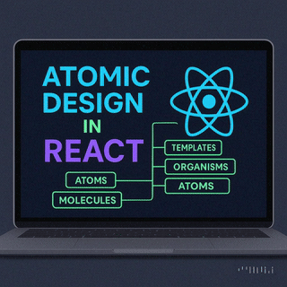
Learn how Atomic Design enhances React component organization by breaking down UIs into reusable, scalable pieces while navigating common challenges.
Jun 6, 2025
Read More
AI is revolutionizing how brands communicate. In this article, we dive into how Phrasee, a leader in AI-powered brand language generation, is enabling marketing teams...
Jun 6, 2025
Read More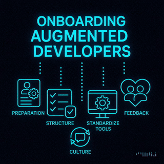
Effective onboarding of augmented developers in Agile teams boosts productivity and retention through preparation, structured processes, and continuous feedback.
Jun 5, 2025
Read More
Selecting the right tech stack for your MVP is crucial for startup success, impacting costs, scalability, and development speed.
Jun 5, 2025
Read More
Learn key strategies for scaling your SaaS product from MVP to enterprise level, focusing on architecture, performance, security, and cloud optimization.
May 26, 2025
Read More
Explore seven human-centered design principles that can transform your MVP into a user-centric product that resonates and drives success.
Jun 9, 2025
Read More
Optimize memory usage in AI workflows to cut costs and enhance performance with effective strategies and tools for better resource management.
May 29, 2025
Read More
Explore the essential UI/UX best practices for SaaS applications in 2025, focusing on personalization, accessibility, and innovative input methods.
May 26, 2025
Read More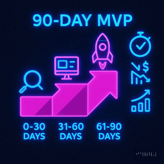
Learn how a 90-day MVP sprint can minimize risk, cut costs, and ensure a successful product launch through rapid validation and user feedback.
May 30, 2025
Read More
Optimize real-time streaming with effective data compression techniques that reduce latency and enhance performance across various industries.
Jun 17, 2025
Read More
Explore the strengths and weaknesses of Supabase and Firebase for real-time collaboration tools, focusing on scalability, performance, and developer experience.
Jun 6, 2025
Read More
Explore the differences between two leading platforms for MVP scaling, focusing on their database structures, pricing, security, and performance.
Jun 5, 2025
Read More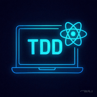
Learn how Test-Driven Development (TDD) can enhance the reliability and maintainability of React applications through structured testing.
Jun 6, 2025
Read More
Learn how to effectively balance technical debt with innovation to ensure sustainable growth and maintain a competitive edge in your startup.
May 29, 2025
Read More
Learn how to foster a thriving knowledge-sharing culture in remote teams through psychological safety, technology, and effective communication.
Jun 6, 2025
Read More
A complete guide to choosing the right mobile app development company—covering expertise, transparency, UX focus, agile methods, and long-term partnerships to ensure your app succeeds...
Jun 12, 2025
Read More
Explore effective caching strategies for dependency management that enhance build performance and reduce costs in software development.
Jul 29, 2025
Read More
Unlock your system's performance potential by effectively analyzing logs to identify bottlenecks and optimize operations.
Jun 17, 2025
Read More
Explore essential practices for checkpointing in stream processing to ensure data integrity, fault tolerance, and efficient recovery from failures.
Jun 9, 2025
Read More
Learn how to effectively use a popular JavaScript library for mocking and stubbing in tests, enhancing reliability and speed in your development process.
Jun 9, 2025
Read More
Learn how to effectively automate regression testing in CI/CD pipelines to enhance software reliability and speed up development.
Jun 17, 2025
Read More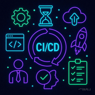
Learn essential best practices for managing secrets in CI/CD pipelines to protect sensitive data and enhance security against breaches.
Jun 6, 2025
Read More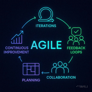
Explore how Agile roles enhance MVP development by fostering collaboration, speeding up delivery, and ensuring products meet user needs.
Jun 11, 2025
Read More
Explore how manual testing enabled startups to launch high-quality MVPs in just 90 days, ensuring speed without sacrificing user experience.
Jun 6, 2025
Read More
AI-driven predictive scaling enhances resource management in DevOps by forecasting demand, reducing costs, and ensuring system reliability.
Jul 29, 2025
Read More
Learn how to effectively scan and fix vulnerabilities in React and Node.js projects to ensure secure applications and safeguard against risks.
Jun 17, 2025
Read More
Agile sprints streamline MVP development, enabling rapid iterations, user feedback integration, and efficient project management for startups.
Jun 17, 2025
Read More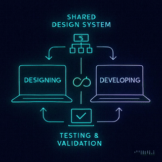
Aligning designers and developers through shared standards and effective collaboration can drastically improve efficiency and product quality.
Jun 11, 2025
Read More
Align your teams for faster MVP sprints by creating a shared vision, setting collaborative KPIs, and leveraging effective workflows.
Jul 29, 2025
Read More
Explore essential best practices for regression testing in DevOps, ensuring software stability and quality amid rapid development cycles.
Jul 29, 2025
Read More
Learn how to create an effective shared knowledge base that enhances team collaboration, boosts productivity, and maintains security.
Jul 30, 2025
Read More
Explore how a financial startup launched a minimum viable product in just 90 days through collaborative prototyping and user feedback.
Jul 29, 2025
Read More
Explore how automated load balancing enhances cloud app performance, reduces costs, and ensures reliability during traffic spikes.
Jul 30, 2025
Read MoreGet in Touch
Let's Make It Happen
Get Your Free Quote Today!

Get in Touch
Let's Make It Happen
Get Your Free Quote Today!

You bring the vision. We handle the build.
